My final crit presentation:

Thursday, 25 October 2012
Cinematic Spaces: Final Concepts
Here are my three final paintings for H.G. Well's story The First Man in the Moon.
1. Excerpt 1: The Lunar Morning - beginning of the story in which main characters land on the Moon; it looks like an abandoned place, they are surrounded by rocks but suddenly the sun comes out.

2. Excerpt 1: The Lunar Morning - after the sun came out plants began to grow on the Moon's surface. This dead place changes into a jungle. Plants are different from these on Earth.

3. Excerpt 2: Experiments in Intercourse - men find out they are not alone on the Moon. They are captured by Selenties, the Moon creatures, and introduced to their underground civilization and technology (not in a friendly way).

Cinematic Spaces: Submission Disc Artwork
Submission disc artwork done using part of my final concept painting and colour blue which appears in all three of my works.


Wednesday, 24 October 2012
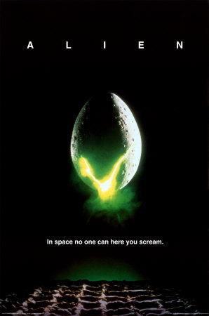
Cinematic Spaces: Alien - Review
Alien is a science-fiction horror movie that was directed by Ridely Scott in 1979. Being an inspiration for many future movies of similiar content, "Nostromo's eight passenger" has it's own dark style and mood, which can scare a viewer in many different ways.

Everything starts on a space-ship called Nostromo, coming back from Thedus to Earth hauling a refinery and twenty million tons of mineral ore. Its crew, consisting of seven people, is being awaken long before the landing with an unknown signal from nearby planetoid being the reason of it.
Problems starts when Executive Officer Kane (John Hurt) discovers a chamber filled with eggs in an abandoned alien spaceship, and one of newborn 'space-babies' called by the movie makers "facehugger" attaches to his face.
"There's something different about the mood right from the start."
(Cavagna, 1999)
Alien starts slowly. The audience is introduced to the surrounding space, the whole ship, specific chambers. The whole process of the crew awakening is almost letargic, as if the movie makers wanted the viewers to feel the sleepiness. Such mood lasts quite long, and even when the action begins speeding up, there are moments of almost boring suspence. Movie critics and reviewers used to call this feature of Alien a flaw, but little did they think about how this slow pace is making the audience nervous. Knowing from the start that something is going to attack the crew, waiting for it in silence, and finally knowing it's appeared, must be the best-thought-out way of creating the atmosphere. Moreover, the Alien's image is rather blurry and not precise as it's not fully shown during the whole movie. People can only imagine his whole appearance, knowing how details and parts of its body look like.
"Alien shouldn’t be as good as it is (...). It follows the conventions of the horror genre and doesn’t have anything compelling or fascinating. The reason why Alien works is because the look of the film is crafted and captured like a serious sci-fi picture. "
(Blake Ewing, 2009)

With Hans Rudolf "Ruedi" Giger, a Swiss surrealist painter, sculptor, and set designer, as a maker of the world and its elements, Alien couldn't turn out looking fake. Every element of this world has been precisely constructed, in the beginning with scrap metal parts or ordinary trash. Some elements of it, for example Alien's body evolution steps, have been made with use of farm animals products, like chicken eggs or cow's stomach. The crew's reaction for the scene which sees the 'baby-alien' bursting out of Kane's chest was completely natural. They were not expecting fake blood and such drama, and probably that's why the whole moment and emotions look real. The same goes for the whole set and surroundings. They seem very true-to-life and the viewer can almost feel like they're inside the space-ship, wandering around something existing.
"The first time we get a good look at the alien, as it bursts from the chest of poor Kane (John Hurt). It is unmistakably phallic in shape, and the critic Tim Dirks mentions its "open, dripping vaginal mouth."
(Ebert, 2003)
Ebert quotes Tim Dirks in his review mentioning elements of Alien reminding of sexual organs. There's a whole theory around these movie details, consisiting of philosophical support and many thesis. It is said to be aiming on the male part of the audience, making it suffer psychicially, knowing that every element is constructed in a way which should strike man's mind and leave a mark on it. Scene with the "facehugger" is supposed to be a revange on males for all cruel rape movies in which vulnerable women were being attacked.
O'Bannon, the screenplay writer, later described the sexual imagery in Alien as intentional: "(...) I'm going to attack them (the audience) sexually. And I'm not going to go after the women in the audience, I'm going to attack the men. I am going to put in every image I can think of to make the men in the audience cross their legs. Homosexual oral rape, birth. The thing lays its eggs down your throat, the whole number."
With the movie filled with sexual tension, horror, suspence and drama, Alien couldn't be a disaster. Even starting as a B-Movie, it made its place in the canon of science-fiction and horror genre, well known, remembered and rewatched throughout the ages.
Bibliography:
1. Quotes:
* Cavagna Carlo, 1999, online source: http://www.aboutfilm.com/movies/a/alien.htm
* Blake Ewing James, 2009, online source: http://cinemasights.com/?p=358
* Ebert Roger, 2003, online source: http://rogerebert.suntimes.com/apps/pbcs.dll/article?AID=/20031026/REVIEWS08/310260301/1023
2. Stills:
* Poster: http://25.media.tumblr.com/tumblr_m87vtoDt0v1r1gn83o1_400.jpg
* Still1: http://www.allmoviephoto.com/photo/1979_alien_012.html
* Still2: http://deathtothemovies.com/the-cinefiles-project

Everything starts on a space-ship called Nostromo, coming back from Thedus to Earth hauling a refinery and twenty million tons of mineral ore. Its crew, consisting of seven people, is being awaken long before the landing with an unknown signal from nearby planetoid being the reason of it.
Problems starts when Executive Officer Kane (John Hurt) discovers a chamber filled with eggs in an abandoned alien spaceship, and one of newborn 'space-babies' called by the movie makers "facehugger" attaches to his face.
"There's something different about the mood right from the start."
(Cavagna, 1999)
Alien starts slowly. The audience is introduced to the surrounding space, the whole ship, specific chambers. The whole process of the crew awakening is almost letargic, as if the movie makers wanted the viewers to feel the sleepiness. Such mood lasts quite long, and even when the action begins speeding up, there are moments of almost boring suspence. Movie critics and reviewers used to call this feature of Alien a flaw, but little did they think about how this slow pace is making the audience nervous. Knowing from the start that something is going to attack the crew, waiting for it in silence, and finally knowing it's appeared, must be the best-thought-out way of creating the atmosphere. Moreover, the Alien's image is rather blurry and not precise as it's not fully shown during the whole movie. People can only imagine his whole appearance, knowing how details and parts of its body look like.
"Alien shouldn’t be as good as it is (...). It follows the conventions of the horror genre and doesn’t have anything compelling or fascinating. The reason why Alien works is because the look of the film is crafted and captured like a serious sci-fi picture. "
(Blake Ewing, 2009)

With Hans Rudolf "Ruedi" Giger, a Swiss surrealist painter, sculptor, and set designer, as a maker of the world and its elements, Alien couldn't turn out looking fake. Every element of this world has been precisely constructed, in the beginning with scrap metal parts or ordinary trash. Some elements of it, for example Alien's body evolution steps, have been made with use of farm animals products, like chicken eggs or cow's stomach. The crew's reaction for the scene which sees the 'baby-alien' bursting out of Kane's chest was completely natural. They were not expecting fake blood and such drama, and probably that's why the whole moment and emotions look real. The same goes for the whole set and surroundings. They seem very true-to-life and the viewer can almost feel like they're inside the space-ship, wandering around something existing.
"The first time we get a good look at the alien, as it bursts from the chest of poor Kane (John Hurt). It is unmistakably phallic in shape, and the critic Tim Dirks mentions its "open, dripping vaginal mouth."
(Ebert, 2003)
Ebert quotes Tim Dirks in his review mentioning elements of Alien reminding of sexual organs. There's a whole theory around these movie details, consisiting of philosophical support and many thesis. It is said to be aiming on the male part of the audience, making it suffer psychicially, knowing that every element is constructed in a way which should strike man's mind and leave a mark on it. Scene with the "facehugger" is supposed to be a revange on males for all cruel rape movies in which vulnerable women were being attacked.

O'Bannon, the screenplay writer, later described the sexual imagery in Alien as intentional: "(...) I'm going to attack them (the audience) sexually. And I'm not going to go after the women in the audience, I'm going to attack the men. I am going to put in every image I can think of to make the men in the audience cross their legs. Homosexual oral rape, birth. The thing lays its eggs down your throat, the whole number."
With the movie filled with sexual tension, horror, suspence and drama, Alien couldn't be a disaster. Even starting as a B-Movie, it made its place in the canon of science-fiction and horror genre, well known, remembered and rewatched throughout the ages.
Bibliography:
1. Quotes:
* Cavagna Carlo, 1999, online source: http://www.aboutfilm.com/movies/a/alien.htm
* Blake Ewing James, 2009, online source: http://cinemasights.com/?p=358
* Ebert Roger, 2003, online source: http://rogerebert.suntimes.com/apps/pbcs.dll/article?AID=/20031026/REVIEWS08/310260301/1023
2. Stills:
* Poster: http://25.media.tumblr.com/tumblr_m87vtoDt0v1r1gn83o1_400.jpg
* Still1: http://www.allmoviephoto.com/photo/1979_alien_012.html
* Still2: http://deathtothemovies.com/the-cinefiles-project
Cinematic Spaces: Creative Partnership Archived
For this project my creative partners are:
Peta-Gaye Brown: http://peta-gayebrown.blogspot.co.uk/
George Nwosisi: http://georgenwosisi.blogspot.co.uk/
Creative Partnership Archived:
My comments on Peta-Gaye's works:
1. Samantha21 October 2012 05:05
In my opinion number 6 works the best : ))
2. Samantha21 October 2012 05:09
Hey there! This is looking really interesting! I would try adding some more details in foreground to make the buildings stand out some more.
Still, it's looking great : ))
3. Samantha20 October 2012 13:03
First one looks more like a snowy place when third seems to be rocks and ground.
I vote for number three! : D
4. Samantha20 October 2012 09:11
These are looking amazing! I love how twisted they are! Are you going to make them more transparent? I think this would help to make them even more glass-alike!
Still, looking great! I can't wait to see your final concepts : )
5. Samantha6 October 2012 10:44
You are absolutely right! Composition in here is great and feels like a movie screenshot.
If I were you, I would think about adding few more details to liven it all a little bit more : ))
Can't wait to see more from you, as it seems you are speeding up! : )
6. Samantha4 October 2012 07:49
I somehow like everything that's on the page number 4. There's something really interesting in the way you put gray on it, though ideas themselves are great as well.
I can't wait to see more from you : )
7. Samantha4 October 2012 08:00
I think by having these - you could easy start building the certain building, or even the whole view of the place : )
Don't be afraid and go for it!
*easly
And what my drawing tutor used to say: "Even if you think that right now it's not a good time to start drawing - do it. Produce 100 ugly pictures and be sure, that 101 is going to be epic"
8. Samantha24 October 2012 12:41
My comments on George Nwosisi's works:
1. Samantha20 October 2012 13:01
I wonder how this piece will change into the final one : ) Can't wait to see it!
I don't like that grainy effect though. It doesn't look real. Maybe try experimenting more with colours : )
2. Samantha20 October 2012 08:04
It's good to see new works from you, George : )
I think that if you work on this piece a little bit more, it will be a very good final piece.
To everything that Phil wrote I'd like to add one more thing - think about the lightning around the windows. If you want them to be purely white give the viewers a hint of "why they are so white". Maybe light beams on the ground, or some feathering around the window frames.
I'm encouraging you to trying different ideas and ways of achieving the "spooky mood" : )
Good luck and keep it up!
Peta-Gaye's comments on my works:
1. Peta-gaye BrownOctober 21, 2012 10:52 AM
hi Samantha I'm really loving 3.1 and 1.5 the framing of 1.5 works so well :)
2. Peta-gaye BrownOctober 10, 2012 1:55 PM
I really like the rock formation in the first image and the lighting in the second, these look really good :)
ReplyDelete
3. Peta-gaye BrownOctober 6, 2012 3:34 PM
Hi samantha,
I really like your first two concepts of the cavern, I love the grainy texture that the first drawing has. The use of lighting is very strong in the second drawing, and i think that the atmosphere that the lighting creates is really interesting. I can't wait to see how you push these concepts.
4. Peta-gaye BrownOctober 4, 2012 9:07 PM
hi samantha your work is amazing i really love the layouts in set 7 especially the green one, but i'm really drawn to the colour palette in set 2
George Nwosisi's comments on my works:
1. George NwosisiOctober 10, 2012 10:02 PM
HI Samantha
these thumbnails are really powerful, i love how you've used colors to bring your thumbnails to life and making it speak for itself. nice work.
Other:
Apart from commenting uploaded works we also helped each other during working on thumbnails and final concepts, giving opinions and pieces of advice.
Cinematic Spaces: Photoshop Workshops 12.10.2012
Practising "Free transform" option, together with perspective and others:


Sometimes it helps when someone looks at a picture with that "fresh eye" and see something different in it. Mysterious white line in first picture is not the point; the whole conctruction on the left is.
Monday, 22 October 2012
Cinematic Spaces: Barbarella - Review
Barbarella is a Franco-Italian
movie made in 1968 by Roger Vadim. The story was based on French series of
comic books Barbarella by Jean-Claude
Forest.

This plot is not really a complicated one but basing on comic books, what else could have the film makers done? At first Barbarella seems to be a true heroine, strong woman who can defeat all enemies effortlessly but the truth is she’s more of a weakling in fancy costumes, looking pretty and seeking for physical pleasure and fun.
Just as At-A-Glance representant states in his review:
“I’ll say this for Barbarella; it is successful in its effort to put something on the screen that’s never been put there before. But it begs the question: should this have been put on the screen?”(At-A-Glance, 2011)
Jean-Claude Forest’s comic series was created in 1962 for French
magazine V-Magazine and was stated to be
a ‘first adult science-fiction comic book’, quite scandalous though. However for its author, the character represented a modern emancipated woman in the era of sexual liberation. With such plot filled with sexual tension the movie couldn’t have been any different. If anyone tried watching Barbarella without previous knowledge of the comic they might have had a very hard time understanding the sense of it.

(Pandolfi)
In his review Padolf seems to state a very subjective opinion, not taking under consideration the fact of the time that the movie was made in, and doubting the feeling that all set decorations give off. Perhaps it was the luck of budget, perhaps an informed decision of the film makers and director, but for sure they made a production full of positively overdone environments, starting with Barbarella’s amazing costumes, designed by Jasques Fonteray and Paco Rabanne, through pastel-coloured surrounding and almost sugar-sweet, plastic objects around all characters. This movie is like a pack of candies; you open it expecting something great, you taste it and it’s not your dream flavor but you enjoy it either way, because it’s candy.
“A movie you either love or hate. If you don’t appreciate high camp silliness you’re well advised to sit this one out. And if you have a thing for Serious Film-Making that has profound things to say about the human condition, this is not the movie for you.”
(Dfordoom, 2011)

Vadim’s Barbarella comic book adaptation is worth seeing, either for stating one’s opinion about it or just being a part of cinematic sweetness and world of sexual freedom and sillines for an hour and a half.
Bibliography:
1. Quotes:
* At-A-Glance, 2011, http://www.rinkworks.com/movies/m/barbarella.1968.shtml
* Pandolfi Chris, http://gonewiththetwins.com/pages/archive/barbarella.php
* Dfordoom, 2011, http://princeplanetmovies.blogspot.co.uk/2011/07/barbarella-1968.html?zx=4ed21903158c1f89
2. Stills:
Sunday, 21 October 2012
Cinematic Spaces: Influence Maps and Thumbnails
I decided to create more influence maps to help me sort all my thoughts and put them in right order. Final Fantasy and Avatar locations seemed to have the biggest influence on me not only because of colours, but also because of the way forests have been presented and designed.


Also I managed to create one more thumbnail, this time trying to liven up the background as well. I feel like it's slowly starting to work the way I would like it to.

I think it's time to start working on my final pieces. Anything additional what will happen during this process is surely going to be uploaded here. Accident is often the keys to best solution.


I think it's time to start working on my final pieces. Anything additional what will happen during this process is surely going to be uploaded here. Accident is often the keys to best solution.
Cinematic Spaces: Thumbnails
Few more developed thumbnails for excerpt one The Lunar Morning and the act of vegetation.
To keep my works coherent I had to create scarier version of plants and that's why I decided to use more toxic and flamboyant colours (though I am sure that I exaggerated it and some changes will have to be done during painting final piece).
At first I decided to use previous thumbnails with rocky landscapes and just fill them with plants (of course with different colour variations):
1.0.

1.2.

1.3.

After that I wanted to play some more with this first piece by copying some parts and placing them around:
1.4.

1.5.

Following the idea of remaking previous thumbnails I created next piece based on my "renoir painting thumbnails":
2.0.
 I think it gives the right impression of scary and dangerous environment and is somehow more interesting. Unfortunately resolution is very small, because previous thumbnail was no bigger than 700px.
Before my eyes fell out of my head I started looking for inspiration around the Internet to create something new not based on previous drawings.
3.0.

3.1.

I think there's is something nice in them, though it's still not "IT". I need to keep looking and trying before actually creating a final piece (I hope I won't ran out of time!).
To keep my works coherent I had to create scarier version of plants and that's why I decided to use more toxic and flamboyant colours (though I am sure that I exaggerated it and some changes will have to be done during painting final piece).
At first I decided to use previous thumbnails with rocky landscapes and just fill them with plants (of course with different colour variations):
1.0.


1.4.


Following the idea of remaking previous thumbnails I created next piece based on my "renoir painting thumbnails":
2.0.

Before my eyes fell out of my head I started looking for inspiration around the Internet to create something new not based on previous drawings.
3.0.


I think there's is something nice in them, though it's still not "IT". I need to keep looking and trying before actually creating a final piece (I hope I won't ran out of time!).
Saturday, 20 October 2012


Friday, 19 October 2012
Cinematic Spaces: Plants 2.0.
Some more ideas of scary plants growing during the Lunar Morning (done in our Photoshop classes 19.10.2012).


1. 2. 3.
After completing third one I started playing with hue/saturation, trying different colours in order to achieve even more toxic feeling. Here is what I ended up with:

Right now they seem to vivid but after placing them into actual concept they might work pretty well.


1. 2. 3.
After completing third one I started playing with hue/saturation, trying different colours in order to achieve even more toxic feeling. Here is what I ended up with:

Right now they seem to vivid but after placing them into actual concept they might work pretty well.
Cinematic Spaces: Plants
My struggle with excerpt three The Fight in the Cave of the Moon Butchers finished slightly different that how I would have expected. After being given advice, I decided to concentrate on excerpt one, The Lunar Morning, again. And to be more precise, on the description of plants' vegetation.
After gathering photos and ideas I created two sheets of silhouettes:


1. 2.


After gathering photos and ideas I created two sheets of silhouettes:


Not all of them resemble actual plants, and that's why I decided to 'design
the inside'. After choosing four random silhouettes I ended up with
these pieces:


1. 2.


3. 4.
In my opinion 1 and 2 should be reconsidered again, because they don't look like plants and they don't give the feeling of a living organism. However 3 and 4 could work as actual designs in my concepts.
What's funny, I ended up creating things scarier than I wanted. Again!
What's funny, I ended up creating things scarier than I wanted. Again!
Wednesday, 17 October 2012
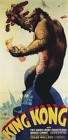
Cinematic Spaces: King Kong - Review

"In modern times the movie has aged, as critic James Berardinelli observes, and "advances in technology and acting have dated aspects of the production." Yes, but very artificial are some of the special effects, however there is a creepiness that isn't there in today's slick, flawless, computer-aided images."
Ebert, 2002
Just like Roger Ebert states in the quotation, King Kong might be an old production, but it remains one of a kind. Its imperfectness seems to be adding a spark of life to the whole moving image, creating pictures scarier than some of nowadays “giant monster adventure” films. The audience can feel the harshness of the jungle, the wildness of island's tribe and the gloom of Kong's cave not because they have been made in a perfect way, but because they now seem so imperfect and somehow “carelessly” done. The movie consists of flaws, scenes which now make people laugh, but maybe this is the most important and key-meaning about King Kong. This film creates unexpected, unnatural violation of the modern flawless worlds and images that surround us during present times.

"The plot was kept simple but believable enough to allow the audience to enjoy the special effects to dominate."
Haflidason , 2001
A mysterious Island, desired, and kidnapped beauty, a horrendous beast and then - a tragedy. This might sum up King Kong's plot but it is not the most important and valuable aspect of that production. The special effects in this movie, which by 1933 were something quite new and exciting, now seem a little bit odd and not really that “special”.
Until 1990's almost every monster movie used a variation on “blue-screen” technique, which allowed matting and blending actors with background, projected separately. In order to get the effect of depth and separate events happening in the foreground and middle ground, the rear previously shot footage was projected, and additional action is photographed in front of the screen.
Thanks to special effects Kong's body, that was only 42 centimeters high, seemed giant. Also full-sized props were used, just like the ape's huge hand or its gigantic head and chest. These days achieving such effects wouldn't be a problem, but back then all these impressed the audience.
"Despite its various deficiencies and occasionally antiquated style, King Kong remains not only a milestone of movie-making, but a magical experience."
Berardinelli , 1994
 The idea for this movie first appeared in Cooper's dreams. He had a vision of a huge ape attacking New York. Making such a movie in the early 30's must have been a huge challenge, though thanks to the effort and the idea itself, King Kong became an iconic film. The final scene which shows Kong climbing the Empire State Building, having a lengthy action sequence, then falling to his death is probably one of the most recognizable and iconic moments in the history of cinema.
Moreover, film producers gave Kong the feeling which people could associate with, perhaps that’s why all the “special-effects” in the production still allow people to see the true values and can treasure them without judging the film only by its age.
Bibliography:
1. Quotes:
1. Quotes:
* Ebert Roger, 2002, http://rogerebert.suntimes.com/apps/pbcs.dll/article?AID=/20020203/REVIEWS08/202030301/1023
* Haflidason Almar, 2001, http://www.bbc.co.uk/films/2001/01/30/king_kong_1933_review.shtml
* Berardinelli James, 1994, http://www.reelviews.net/movies/k/kong_33.html
2. Stills:
* Poster: http://upload.wikimedia.org/wikipedia/commons/thumb/f/f3/Kingkongposter.jpg/220px-Kingkongposter.jpg
* Still 1: http://drnorth.wordpress.com/2009/10/06/king-kong-randomised/
* Still 2: http://upload.wikimedia.org/wikipedia/commons/thumb/f/f3/Kingkongposter.jpg/220px-Kingkongposter.jpg
2. Stills:
CG Artist Toolkit: Maya
Character Part 2: Texturing


Tuesday, 16 October 2012
Cinematic Spaces: Metropolis - Review
“The mediator between head and hands must be the heart!”
Metropolis, 1927
Fritz Lang’s “Metropolis”, 1927, is a German silent movie made in the spirit of early science-fiction cinematography, being probably the precursor of the whole genre, using new techniques and ways of post-production and special effects.

“Metropolis” presents a story of classes dwelling in the city; people responsible for working and making the Heart Machine move, the lower class, and upper one, with people who rule the place. One of the main characters is Freder (Gustav Fröhlich), son of Metropolis’ president Joh Fredersen (Alfred Abel). Freder falls in love with Maria (Brigitte Helm), woman who lives under the city and wants to unite two classes by peace. She preaches about “the mediator” who is supposed to come and be the heart, between head and hands. Meanwhile, scientist Rotwang (Rudolf Klein-Rogge) together with Fredersen, build a human-like robot giving it Maria’s features in a plan which is meant to lead to the collapse of working class people.
“With its immense sets and stark lighting, the workers' city is a credible image of hell, while the overground landscapes were a seminal influence on all subsequent science fiction.” Pierce, 2003
Fritz Lang was under impression of 1924's New York city. Its buildings and skyscrapers were a perfect basis for creating the stunning views in Metropolis. The movie's plot takes place in 2026, although imagined set portrayal resembles current images of agglomeration where art deco stylization was an ornamental style which was imposed during World War I. Its variety of styles is said to have represented the cultural politics of its time, although it suits Metropolis perfectly which shows the differences between the depths and the upper city.
"This highly stylized way of performing is not the place to look for naturalism and subtlety, but it was not unusual in its time and in a story like this, it is quite effective."
Turan, 2010
 In the movie there's no need for dialogues. The plot is so clear and understandable that the viewer has no problems with understanding the situation, the relationships between characters and most important; the aspects of the story. Metropolis' story can be related to current times by its universal approach to the topic of classes and ruling systems. Actors who played the characters were indeed using theatrical gestures, though it is said most of them have never played in any movies before. That exaggeration of movements also gave the movie a fair and luculent view over the plot and following events.
"Metropolis’ special effects are impressively seamless for its era, and they remain adequate today."
Ring, 2012
Metropolis uses special effects which remain and are still used these days. Eugen Schüfftan, a cinematographer who invented the Schüfftan process, a technique that used mirrors to insert actors into miniature sets. He also invented miniatures of the city where it was the first time it was used and also the camera on a swing. The Robots costume had been designed by sculptor Walter Schulze-Mittendorff; it was uncomfortable and stiff though it appeared metallic and allowed a small amount of free movement.

Fritz Lang's Metropolis, 1927, is a one of the science fiction movies which had a great influence on future cinema and the evolution of the genre. This production is universal and is up-to-date whenever it's been watched which allowed it to open the way for future movies, giving new ideas for other productions.
Bibliography:
1. Quotes:
*Pierce Nev, 2003, online source: http://www.bbc.co.uk/films/2003/01/06/metropolis_1927_review.shtml
*Turan Kenneth, 2010, online source: http://articles.latimes.com/2010/may/14/entertainment/la-et-metropolis-20100514
*Ring Robert, 2012, online source: http://scifiblock.com/reviews/movie/metropolis-1927.htm
2. Stills:
* Poster: http://upload.wikimedia.org/wikipedia/en/thumb/0/06/Metropolisposter.jpg/220px-Metropolisposter.jpg
* Still 1: http://borgdotcom.files.wordpress.com/2011/11/metropolis.jpg
* Still 2: https://blogger.googleusercontent.com/img/b/R29vZ2xl/AVvXsEjNe4FDfccHTLY2O0eqaAa705d65xihlPRmg64af0tSjLMoKXHFNuRp-yVZ84EiJ1gWH4jhH22y4oxx6Y41X91QLA9cEQ47eqsGAifXyQlBbN6ioF1fqlCpnlKcOPYHo9yC_766ZRjucy4/s1600/lang_metropolis_moloch_2_stor.png
Metropolis, 1927
Fritz Lang’s “Metropolis”, 1927, is a German silent movie made in the spirit of early science-fiction cinematography, being probably the precursor of the whole genre, using new techniques and ways of post-production and special effects.

“Metropolis” presents a story of classes dwelling in the city; people responsible for working and making the Heart Machine move, the lower class, and upper one, with people who rule the place. One of the main characters is Freder (Gustav Fröhlich), son of Metropolis’ president Joh Fredersen (Alfred Abel). Freder falls in love with Maria (Brigitte Helm), woman who lives under the city and wants to unite two classes by peace. She preaches about “the mediator” who is supposed to come and be the heart, between head and hands. Meanwhile, scientist Rotwang (Rudolf Klein-Rogge) together with Fredersen, build a human-like robot giving it Maria’s features in a plan which is meant to lead to the collapse of working class people.
“With its immense sets and stark lighting, the workers' city is a credible image of hell, while the overground landscapes were a seminal influence on all subsequent science fiction.” Pierce, 2003
Fritz Lang was under impression of 1924's New York city. Its buildings and skyscrapers were a perfect basis for creating the stunning views in Metropolis. The movie's plot takes place in 2026, although imagined set portrayal resembles current images of agglomeration where art deco stylization was an ornamental style which was imposed during World War I. Its variety of styles is said to have represented the cultural politics of its time, although it suits Metropolis perfectly which shows the differences between the depths and the upper city.
"This highly stylized way of performing is not the place to look for naturalism and subtlety, but it was not unusual in its time and in a story like this, it is quite effective."
Turan, 2010
 In the movie there's no need for dialogues. The plot is so clear and understandable that the viewer has no problems with understanding the situation, the relationships between characters and most important; the aspects of the story. Metropolis' story can be related to current times by its universal approach to the topic of classes and ruling systems. Actors who played the characters were indeed using theatrical gestures, though it is said most of them have never played in any movies before. That exaggeration of movements also gave the movie a fair and luculent view over the plot and following events.
 "Metropolis’ special effects are impressively seamless for its era, and they remain adequate today."
Ring, 2012
Metropolis uses special effects which remain and are still used these days. Eugen Schüfftan, a cinematographer who invented the Schüfftan process, a technique that used mirrors to insert actors into miniature sets. He also invented miniatures of the city where it was the first time it was used and also the camera on a swing. The Robots costume had been designed by sculptor Walter Schulze-Mittendorff; it was uncomfortable and stiff though it appeared metallic and allowed a small amount of free movement.

Fritz Lang's Metropolis, 1927, is a one of the science fiction movies which had a great influence on future cinema and the evolution of the genre. This production is universal and is up-to-date whenever it's been watched which allowed it to open the way for future movies, giving new ideas for other productions.
Bibliography:
1. Quotes:
*Pierce Nev, 2003, online source: http://www.bbc.co.uk/films/2003/01/06/metropolis_1927_review.shtml
*Turan Kenneth, 2010, online source: http://articles.latimes.com/2010/may/14/entertainment/la-et-metropolis-20100514
*Ring Robert, 2012, online source: http://scifiblock.com/reviews/movie/metropolis-1927.htm
2. Stills:
* Poster: http://upload.wikimedia.org/wikipedia/en/thumb/0/06/Metropolisposter.jpg/220px-Metropolisposter.jpg
* Still 1: http://borgdotcom.files.wordpress.com/2011/11/metropolis.jpg
* Still 2: https://blogger.googleusercontent.com/img/b/R29vZ2xl/AVvXsEjNe4FDfccHTLY2O0eqaAa705d65xihlPRmg64af0tSjLMoKXHFNuRp-yVZ84EiJ1gWH4jhH22y4oxx6Y41X91QLA9cEQ47eqsGAifXyQlBbN6ioF1fqlCpnlKcOPYHo9yC_766ZRjucy4/s1600/lang_metropolis_moloch_2_stor.png
Monday, 15 October 2012
Cinematic Spaces: Thumbnails
Some more thumbnails for excerpt 3: The Fight in the Cave of the Moon Butchers
To be completely honest, I got a little carried away. Most of these structures were not described in the excerpt (though I might say these are just caves and they come in different shapes and sizes).
I am still unsure about this part; the images are not so clear in my head and I'm afraid of being stuck with last piece.
"(...) at times the cleft narrowed so much that we could scarce squeeze into it, at others it expanded into great drusy cavities (...)"
1.0.

1.1.

1.2.

2.0.

2.1.

2.2.

2.3.

3.0.

3.1.

4.0.

4.1.

4.2.

4.3.

These are a little bit bigger than previous thumbnails I've done, that's why I decided not to put them into sets (though the changes in ideas are still visible).
Also, it's getting even gloomer and scarier.
Subscribe to:
Posts (Atom)
Try maybe adding more contrast on the water surface to make it look less flat, and maybe lighten up the background to add the depth.
Good luck!
9. Samantha24 October 2012 14:29
I wonder about your third piece. Can't wait to see it : )